User experience design (UX) for Web 3
Here I explain how web 3 is different to web 2 (with as little jargon as I can), show examples of poor user experiences, explain why we should not be saying it’s ‘user error’ when people get in trouble, and give some practical advice on how to design good user experiences for web 3.

Over the last year or so I’ve been poking around web 3 – getting some coin, trying out some apps, buying some things. And designing user experiences.
Of all the technologies I’ve designed for in my UX career, it’s been the hardest. There is a lot of jargon, long and complicated processes, and apps that are just hard to understand and use.
In this article, I’ll explain how web 3 is different to web 2 (with as little jargon as I can), show examples of poor user experiences, explain why we should not be saying it’s ‘user error’ when people get in trouble, and give some practical advice on how to design good user experiences for web 3.
About web 3
Although often spoken about as one thing, web 3 is not a single idea. It is a cluster of new technologies and ideas that will often refer to:
- Blockchain
- Cryptocurrencies
- Non-fungible tokens (NFTs)
- Decentralised finance (DeFi)
- Decentralised autonomous organisations (DAOs)
- The metaverse
I’m still learning about web 3 (and trying not to learn too much so I can approach my work with a beginners mind). I've outlined some concepts below that I've found most interesting and new. I’ve deliberately oversimplified these so you can get a broad idea of the difference between web 2 and web 3. And don’t worry if you don’t understand these in detail – you don’t need to for the purpose of this article.
| Web 2 | Web 3 | |
|---|---|---|
| We store our financial assets… | in banks and financial institutions. We trust that they are storing them securely and trust that we can retrieve them whenever we want. | in a digital wallet that we manage. We always have access to them. |
| To transfer money to someone… | we do it via an intermediary like a bank. There is often a delay while it is processed. | we put it straight into their wallet. The transfer happens immediately. |
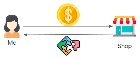
| If something goes wrong with a transaction… | there are layers of protection. For example, if a retailer fails to send a product, we can resolve it with the retailer, service provider or credit card provider. | for example, if we are tricked into sending money to someone or even just send it to the wrong person, decentralisation means there is no-one to help us get it back. |
| To log in to websites and apps we have… | a separate account and login for each site. | a single wallet address that can connect to any site. |
| When we log into websites and apps… | we provide personally-identifying information – at the very least a working email address. | we connect as a wallet address, and the wallet contains no personal information – it is effectively private and anonymous. |
| Our transactions are… | private and not able to be seen except by the company that owns the product. | stored on a blockchain and visible to anyone. |
| Ownership of physical assets… | is primarily individual (individual person, married couple or individual company). | can be shared among a group of people. |
What does web 3 UX look like
As I mentioned in the intro the user experience of web 3, particularly for people new to it, is very poor. Of course, I haven’t seen or used every web 3 app and service, but I’ve used enough to be comfortable making that broad statement.
Let’s look at some examples.
Poor usability: Basic findability
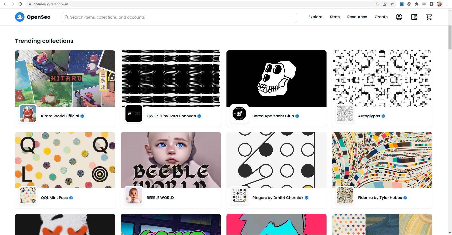
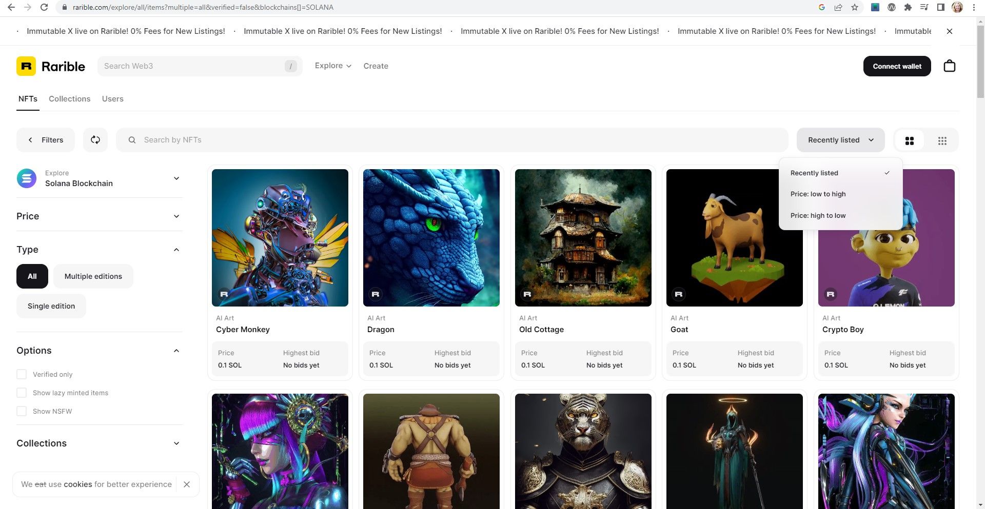
I spend a lot of time on digital art websites – mostly because I like abstract art, but also because it takes me a long time to find anything I like. In general these websites have very poor findability. Most list art in ‘collections’ (releases of multiple pieces of art, usually from one artist) and simply list the collections in alphabetic or release date order. There is rarely a way to find interesting artwork without already knowing about the collection. There is rarely any kind of categorisation, tagging or good filters. To me these are all usability basics for this kind of content.
Poor usability: Expectation that you know how things work
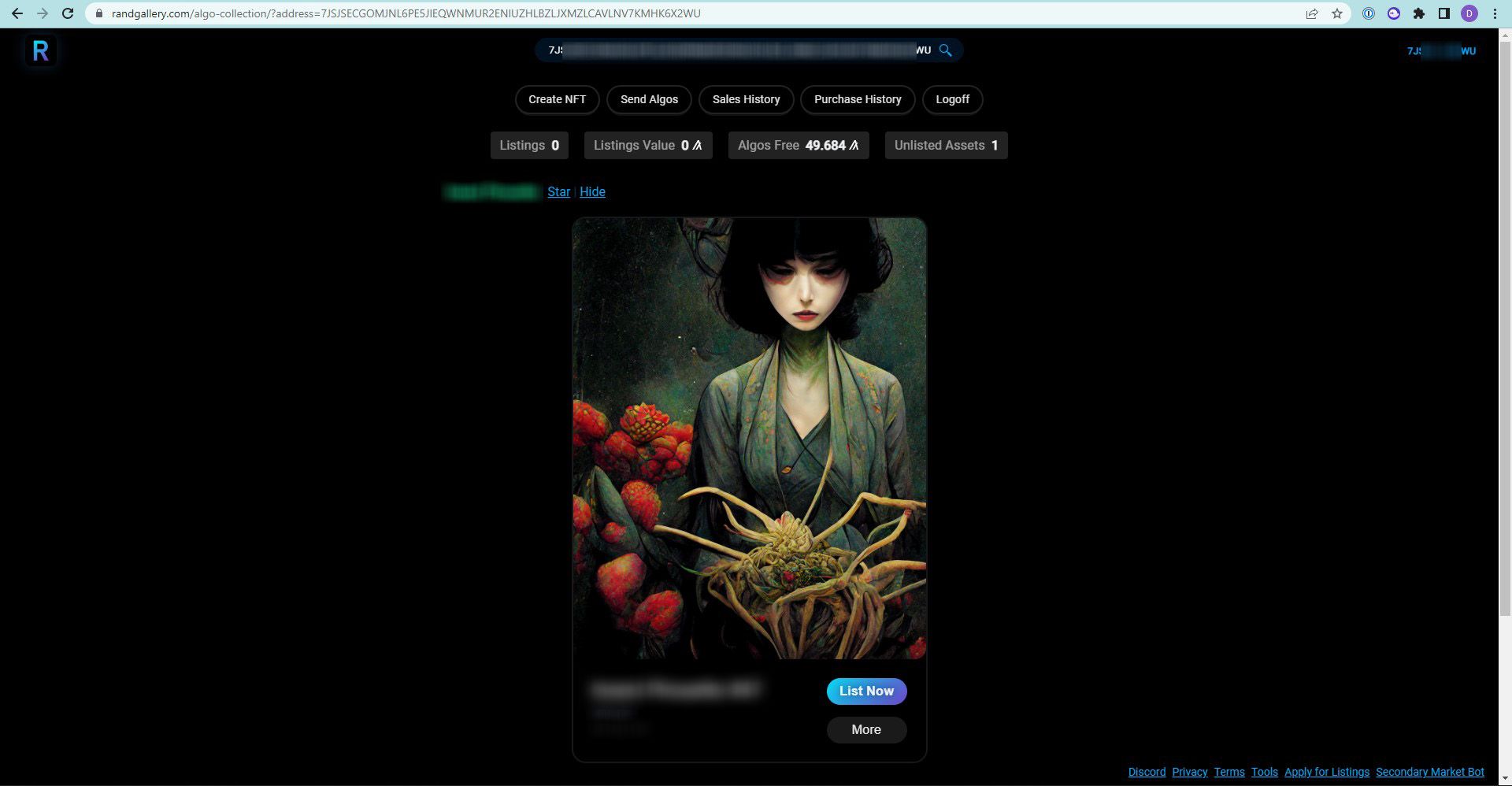
Another common usability failure is that many websites expect that you know how processes work, and provide no way to learn about them if you don’t. For example, I wanted to buy the very cool cat artwork below (I love cubist art and this looks just like my daughter’s cat).
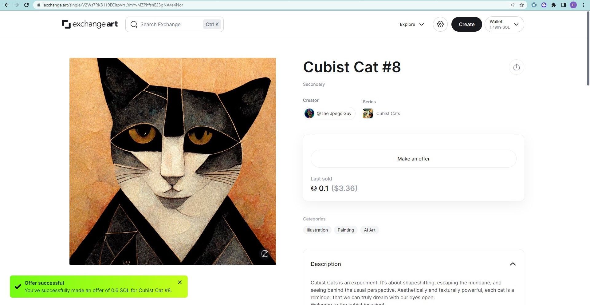
I put in an ‘offer’, got a notification that my offer was successful, but had no idea what to expect next. I didn’t know what the process was for the owner to accept it. I didn’t know what happened to my money in the meantime. I didn’t know if I could undo the offer and get my money back. The screen didn’t update to show status properly, and in some places the copy is incorrect.
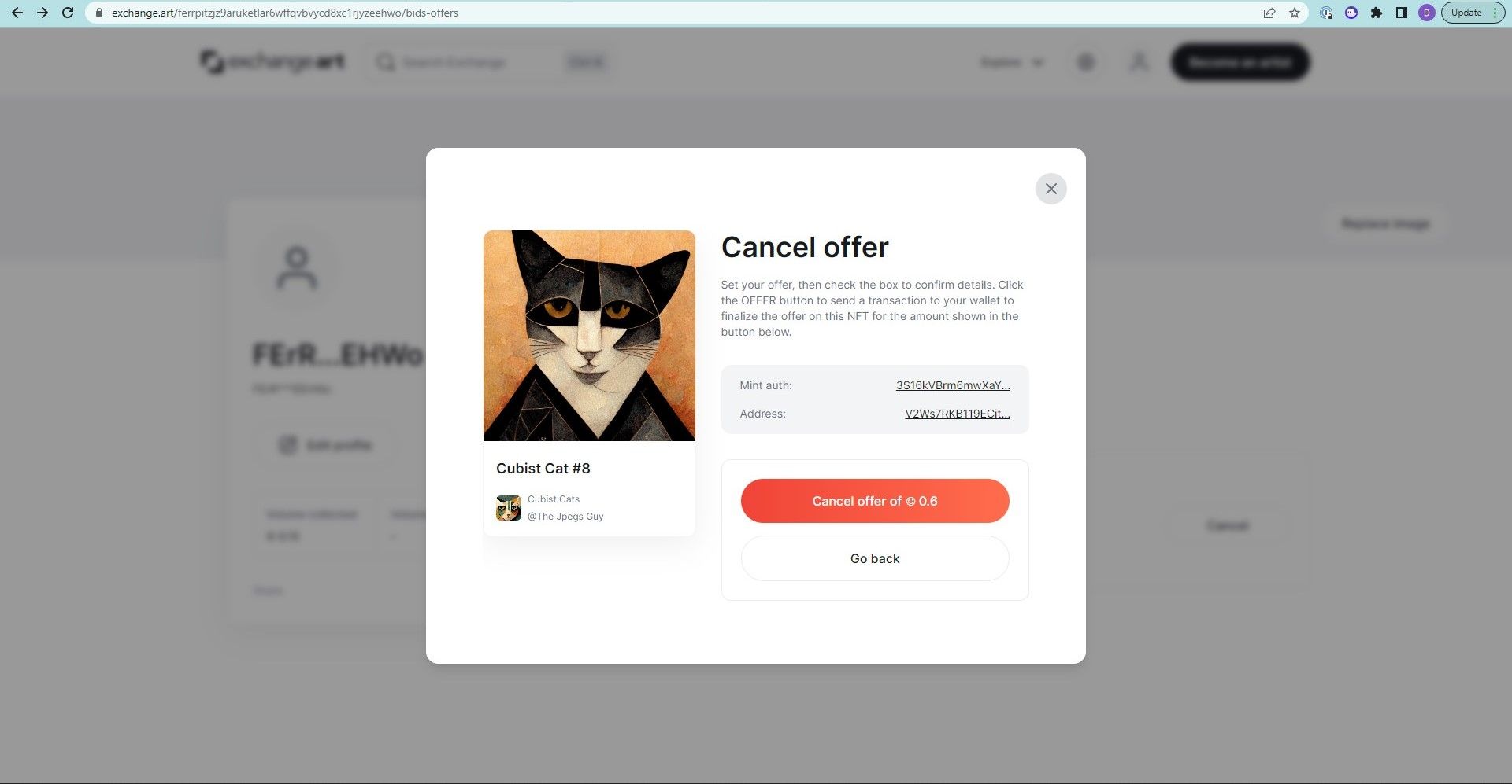
I like this site otherwise – they actually have decent filters and good art – they just need to make it easier to understand the process.
Poor usability: Missing core features
There are many examples of apps where core features are just missing – things that are an important part of a task that are just not catered for. For example, when I buy something (web 2 or web 3), at the end of the process I want to check it worked (I just bought movie tickets online and kept the confirmation screen open until I got a confirmation email).
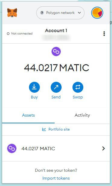
In the example below, I bought a digital art NFT using a wallet called Metamask. I got a confirmation on screen (which was good).
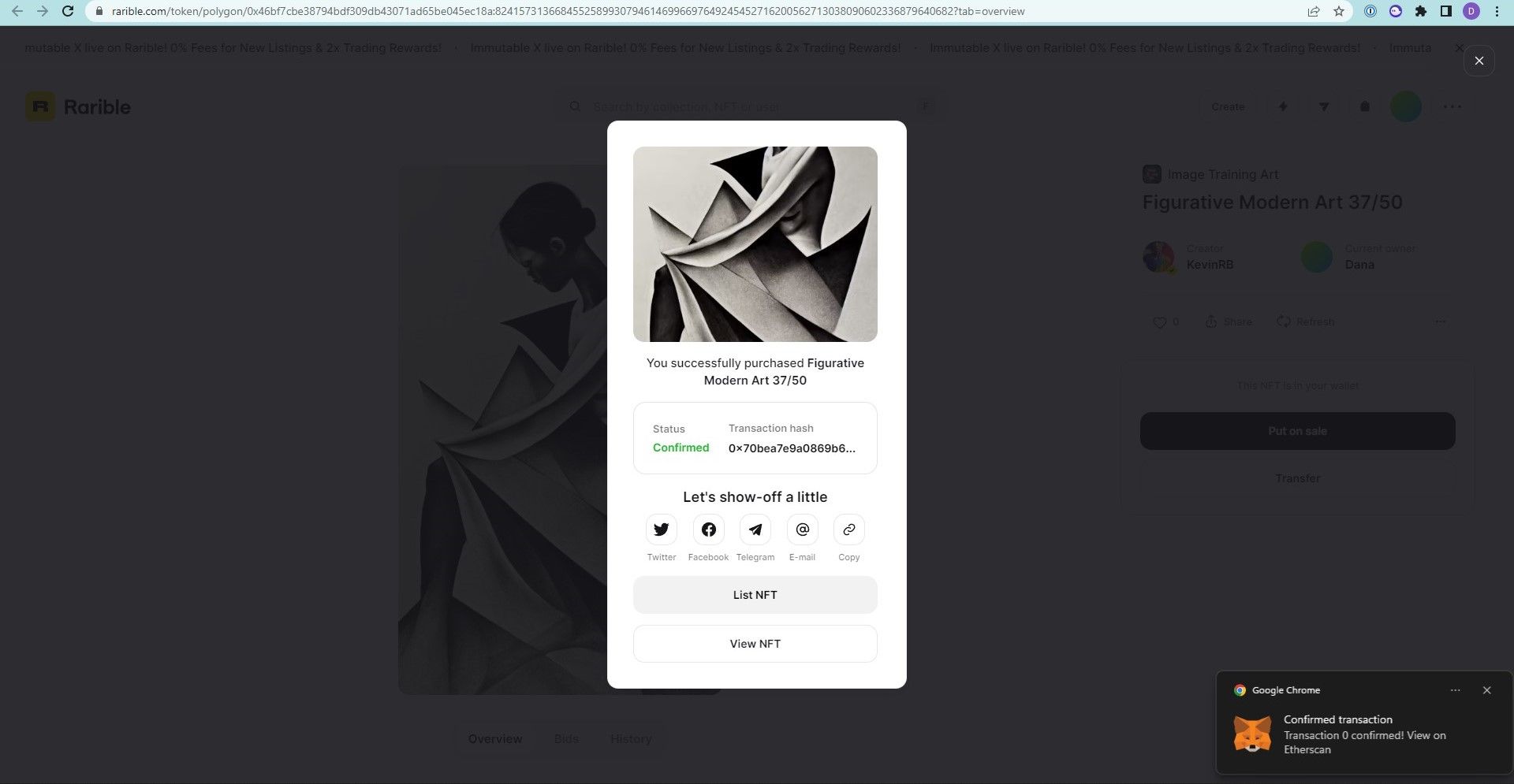
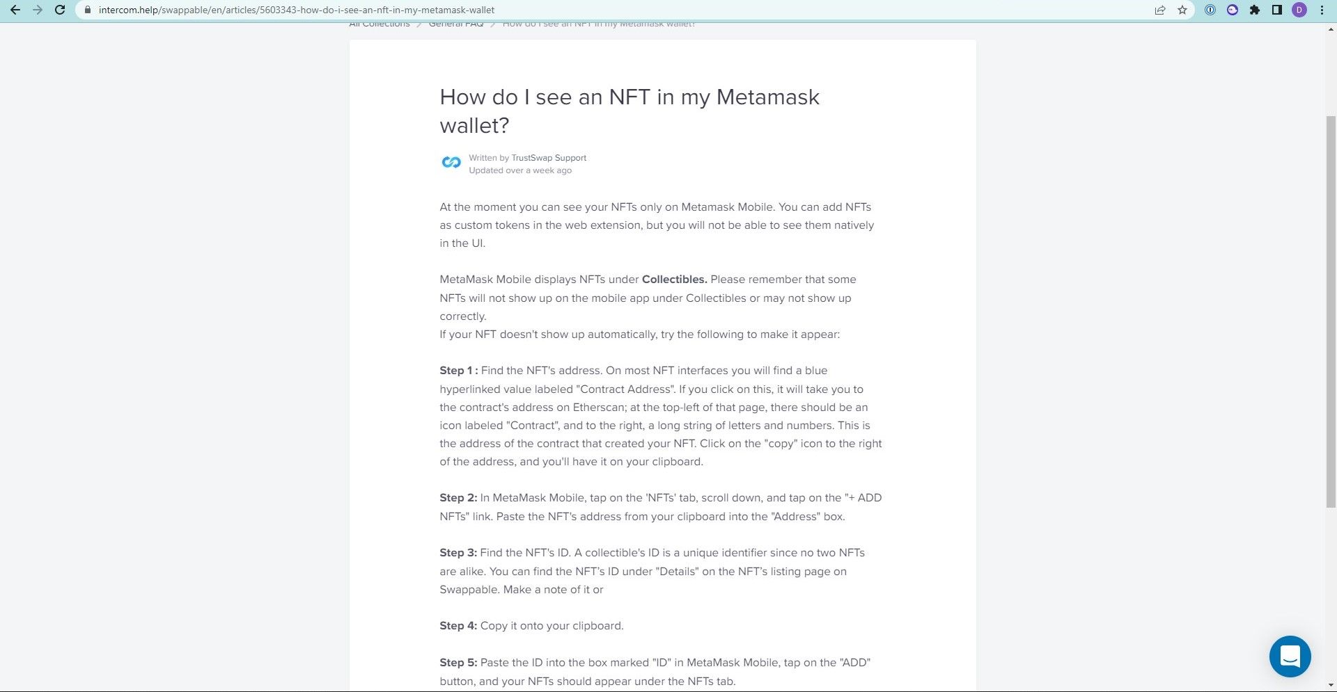
I went to look at it in my wallet, but didn't see it. Every other wallet I’ve used shows an NFT straight away, so of course I worried that my money was taken and nothing delivered.
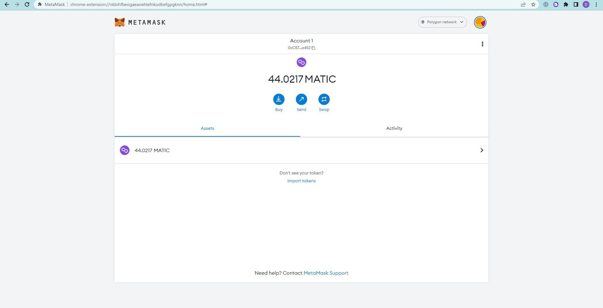
I went googling, as you do in these situations. I found out that actually, Metamask in the browser doesn't show NFTs and for mobile there is a 5 step process that starts with 'Find the NFTs address' (which I didn't know how to do).
A core usability principle is to provide users with feedback about their actions. In this case, the last step is not to say that the transaction worked, but to give people a way to confirm that it worked as expected.
(Later...I was talking to a friend about this experience and they pointed out that this feature had been added. There is now a link to 'Portfolio site', which doesn't really say to me 'go here to look at your NFTs'.)
Long, confusing processes: Account setup
There are many, many examples where processes are both long and confusing.
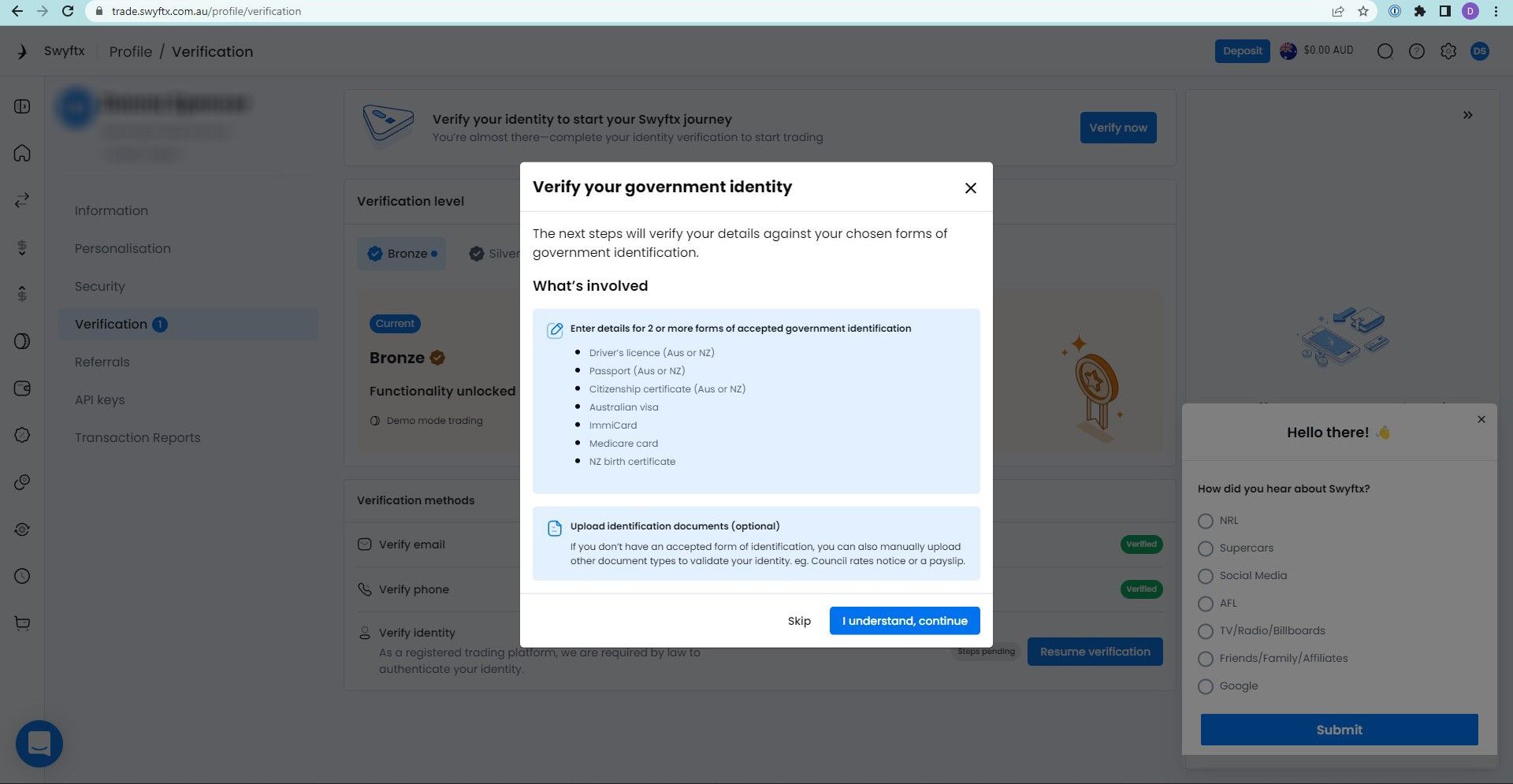
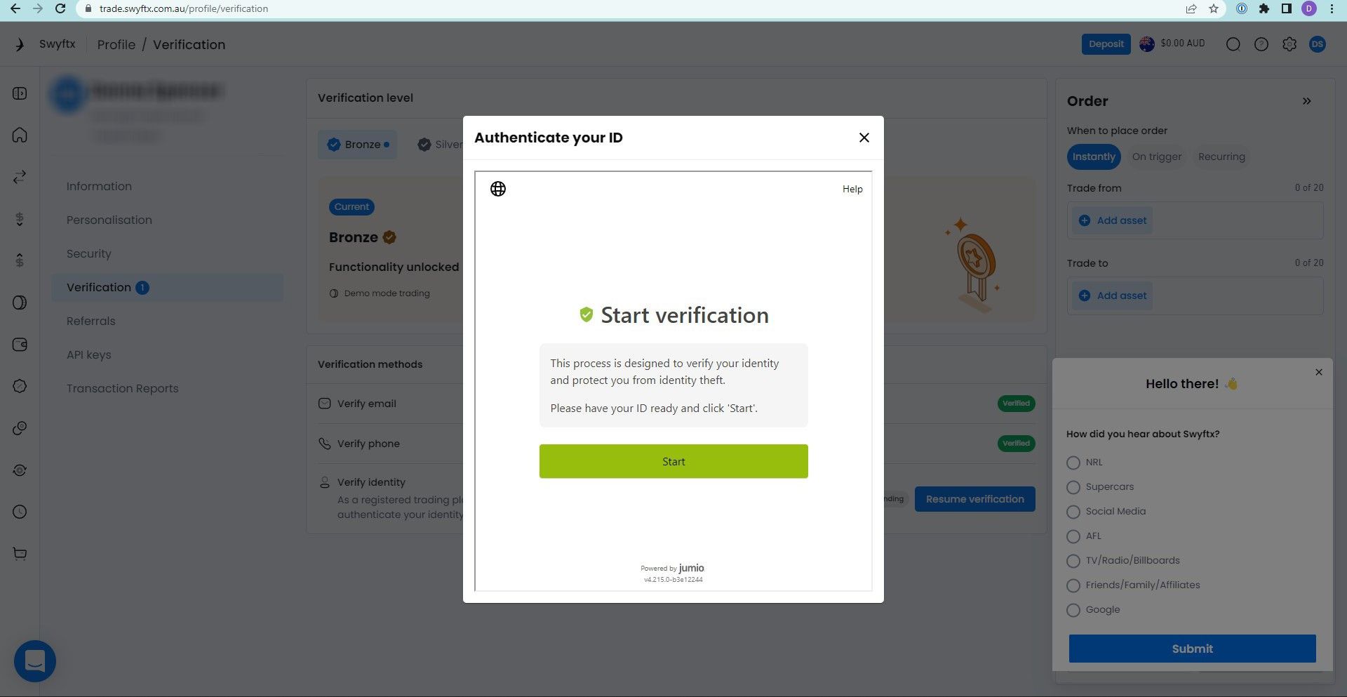
For example, it took me 28 steps to set up an account and buy cryptocurrency.
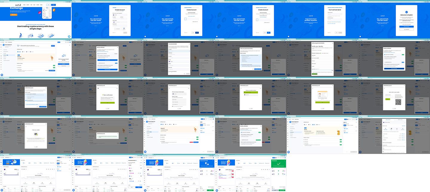
This included some steps that were inaccurate (the screen said I needed 2 forms of ID, but didn’t ask for the second), steps that lacked transparency (an external service that was not branded or explained) and steps where the system didn’t work as it should.
I understand why there are so many steps here – a lot of them are for know your customer (KYC), anti money-laundering/counter terrorism financing (AML/CTF) regulations (and I’m glad these exist). Some of the steps are to explain what’s happening (which I’m also glad for) but this is still a lot of steps and likely off-putting for someone new. I also acknowledge that there are plenty of web2 processes that are long (I don’t know that setting up an account at a new bank would be much better), but right now web 3 is discretionary.
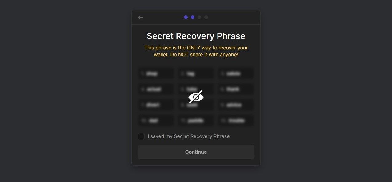
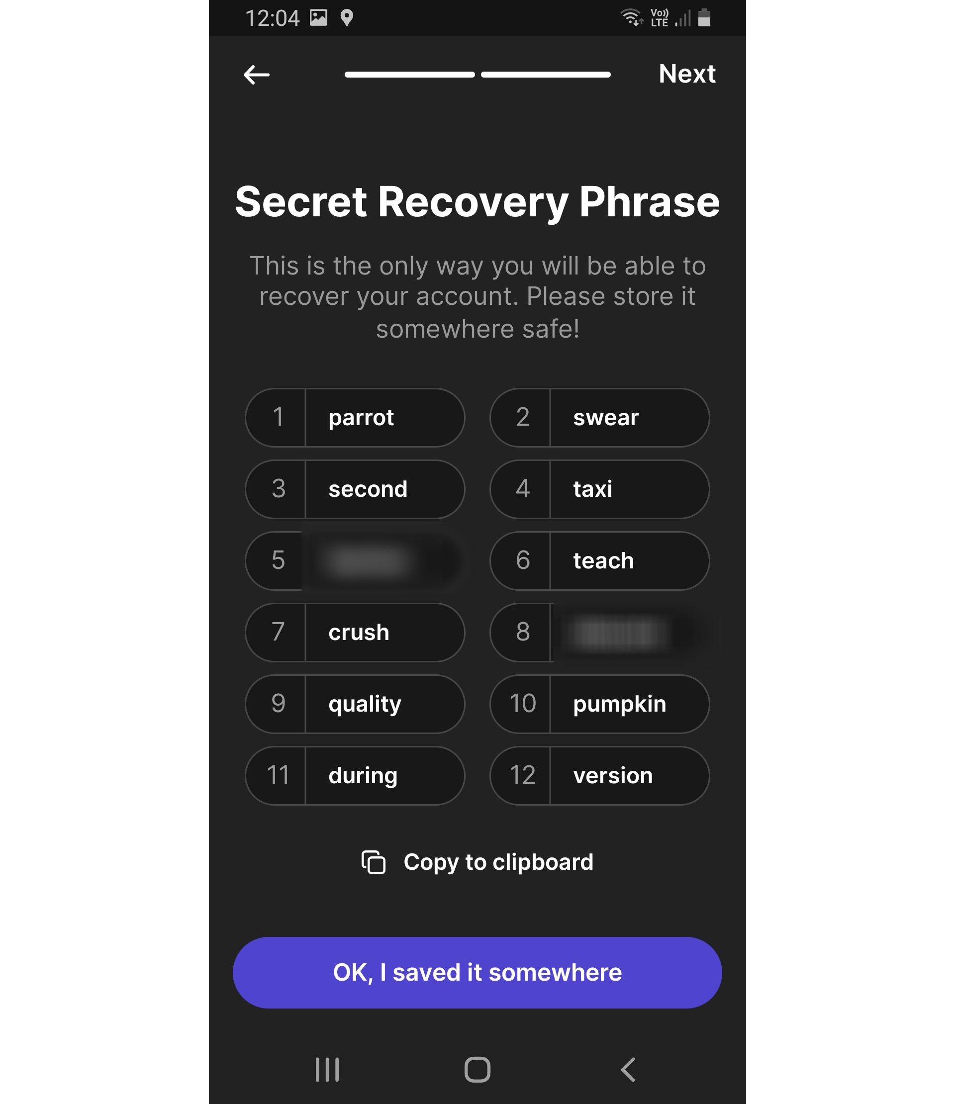
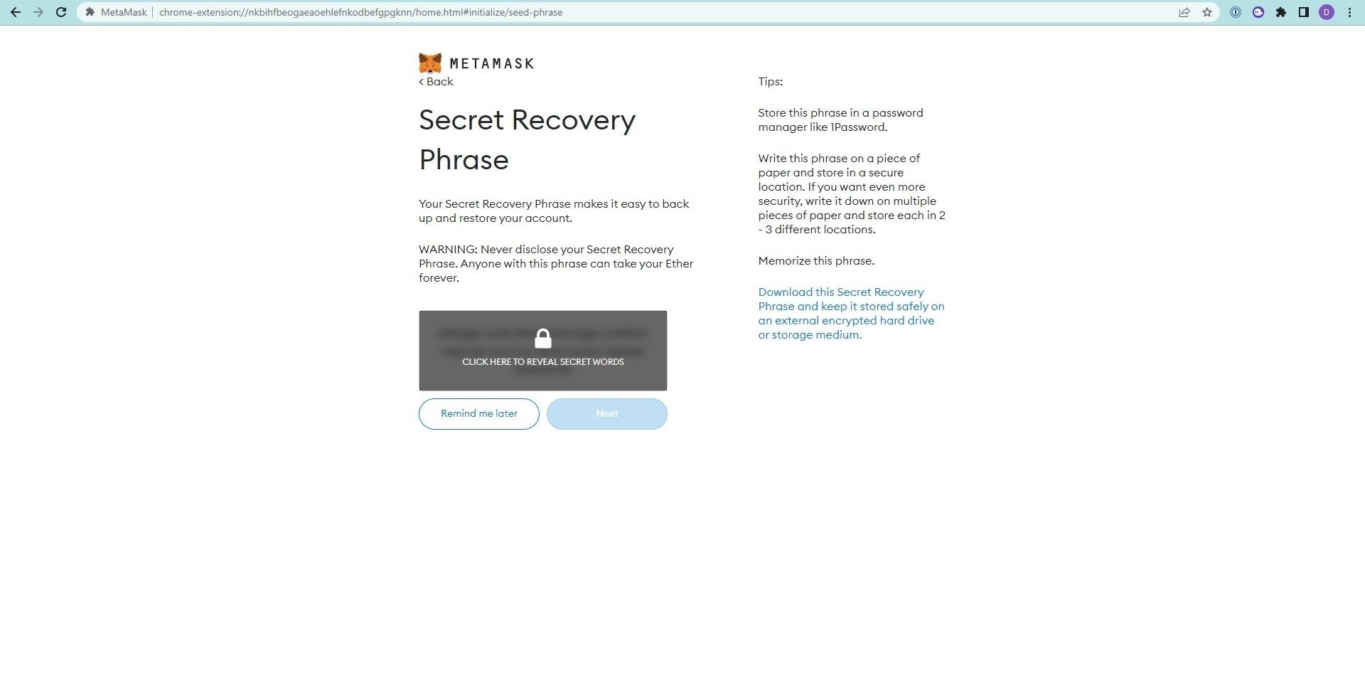
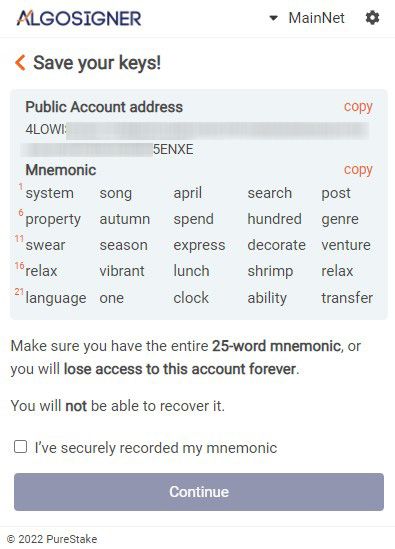
Long, confusing processes: Wallet setup
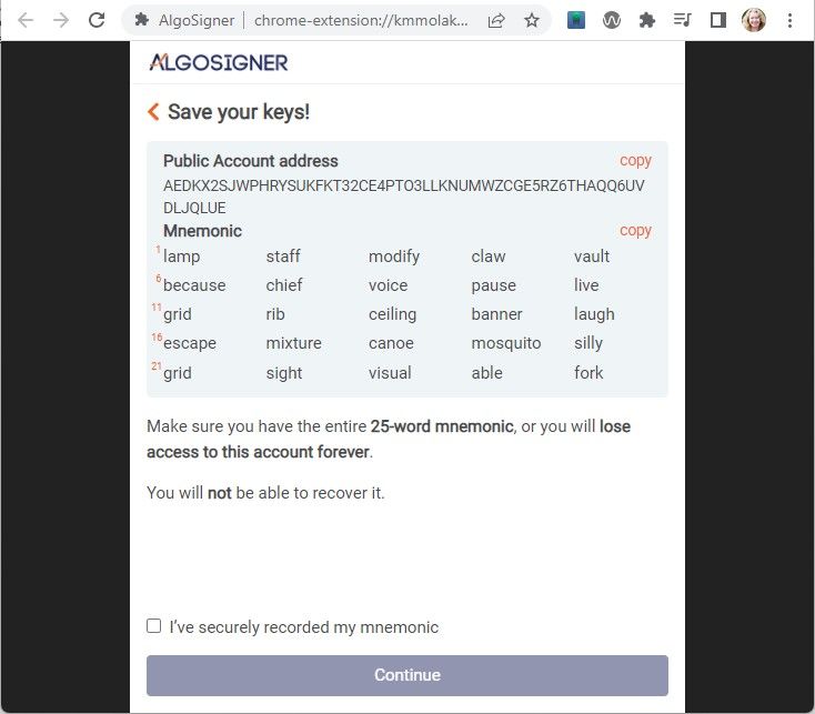
Setting up a wallet is similarly multi-step and confusing and contains what is probably the most well-known UX issue in Web 3, which is that you need to very carefully store the phrase that gives access to your wallet. A 12 to 25 word phrase!. Again, I understand why this happens (there is nowhere to go to get your password reset – this phrase is literally the combination of the safe) but it’s intense and confusing.
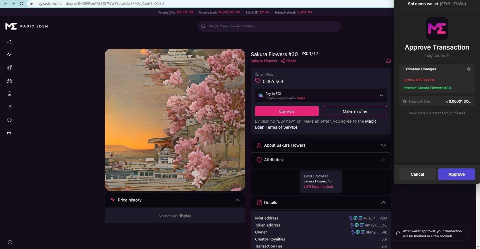
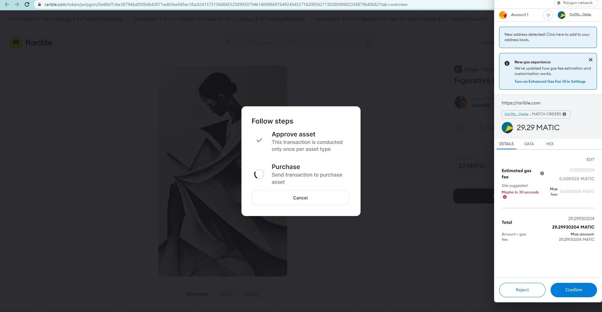
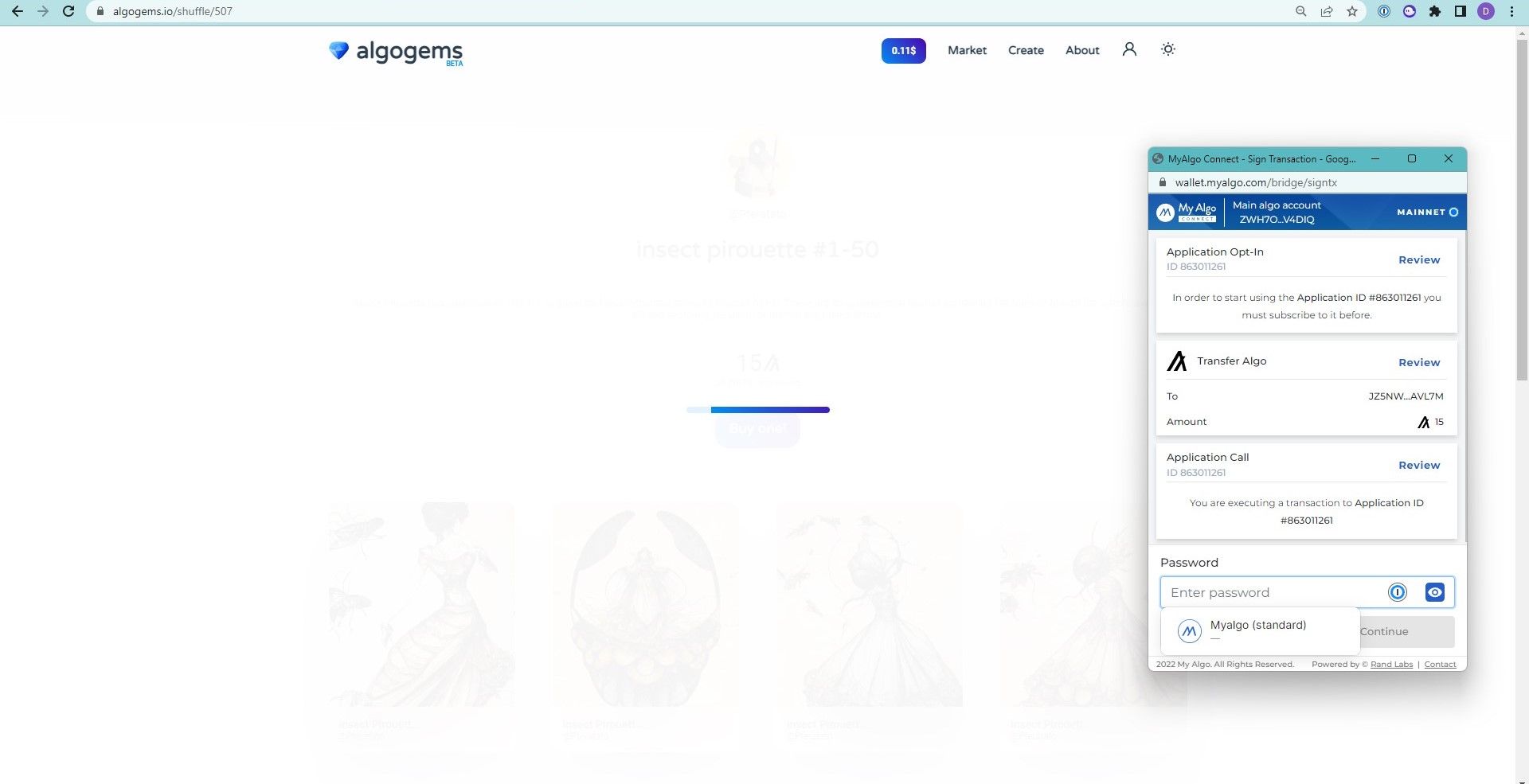
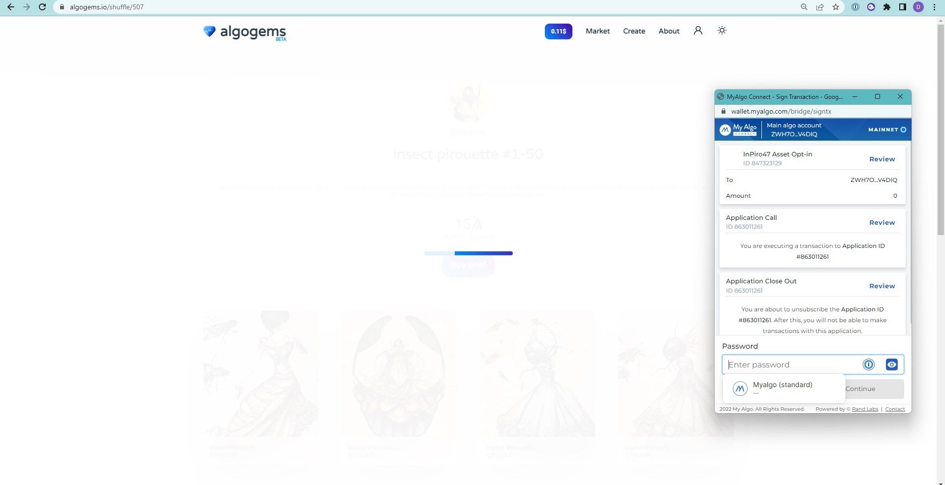
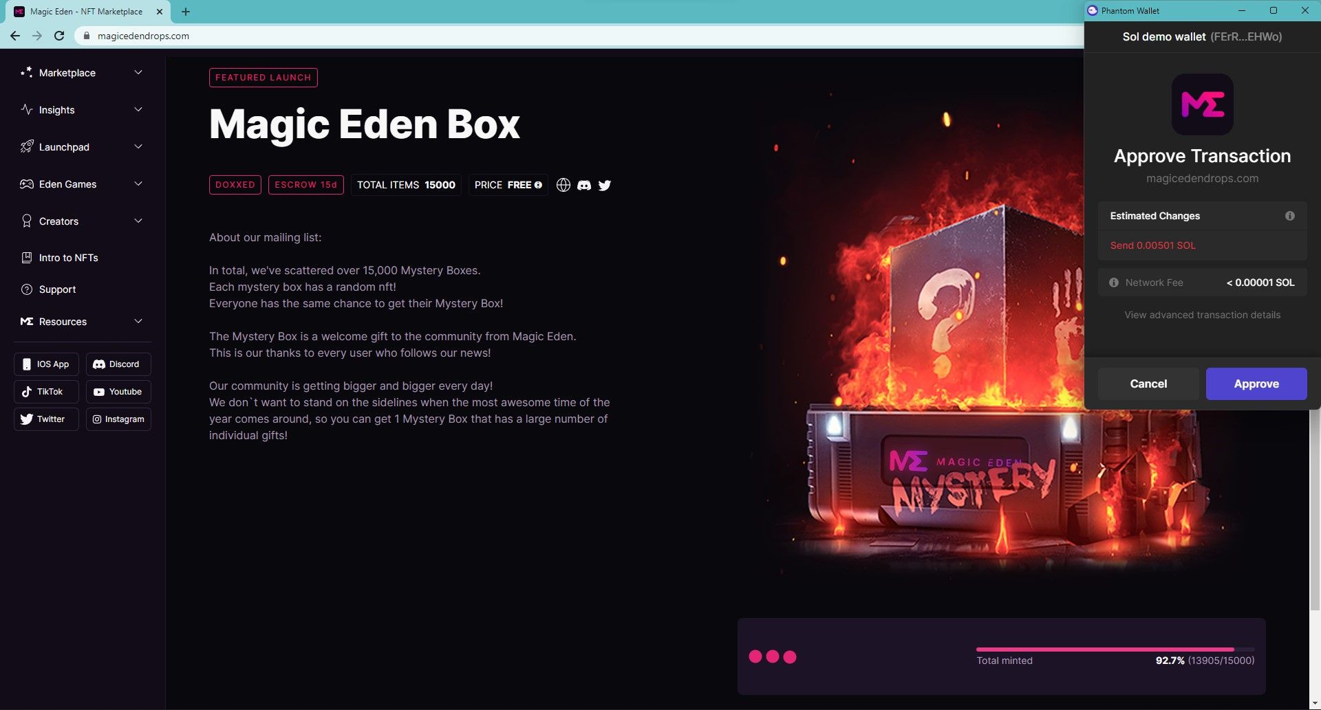
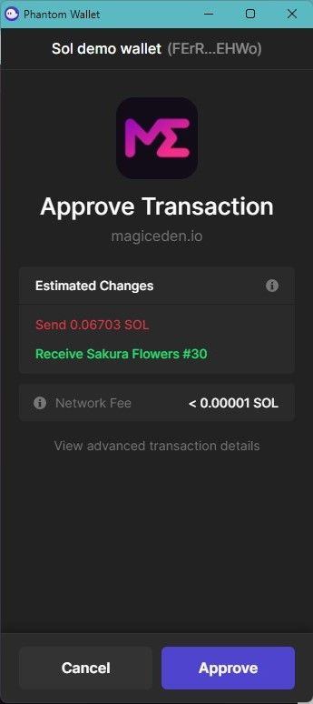
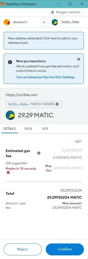
Confusing processes: Buying something
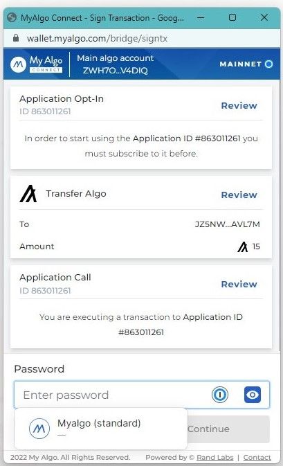
Even worse (did you think it could get worse?) is the experience of actually buying something and handing over your coin. The screenshots below show 3 separate examples of the last step of buying digital art (there are a number of also-confusing steps before this too).
The transaction is very difficult to understand, and is different for each blockchain and wallet.
Now we've looked at some examples of poor usability and confusing processes, let's change direction a little and consider why this is so hard.
How we learn new technologies
When we are faced with something new, we bring our existing experience to it so we can learn and understand it. There are two main mental processes we use – connecting knowledge and applying mental models.
We all have a large amount of experience with websites and apps and we bring it to each new situation. In most cases, we shouldn't have to learn how to use a website or app – we should just be able to connect our existing knowledge. For example if we are using an e-commerce store, a checkout process or a TV streaming service, we really shouldn't need to learn anything new.
The other thing we bring with us is a mental model – an internal mental representation of how something works. When our mental model matches the actual model, it's easy to do tasks and they feel intuitive. When our mental model doesn't match the actual model, tasks feel confusing and difficult.
With new technologies, we will usually have gaps. Gaps in knowledge make it hard to learn and make good decisions. Gaps in mental models cause us to misunderstand processes and make (predictable) mistakes.
Let’s look at some examples where knowledge and mental model gaps cause problems in web 3.
Accounts and sign-in / Wallets and connections
We all sign into multiple websites and apps every day and have accounts all over the place. We have a pretty strong mental model of signing in and what an account is.
We understand that the website / app / company has the content we’ve provided (photos, tweets, posts etc) and information about us in our account. We trust that they are keeping it secure. We also know that many sell it for marketing. We know that they could close at any time and we can lose all of our data (though we hope they don't).
The web 3 model for signing in is quite different (as we are going to see with all these examples). We sign in with a wallet rather than create an account. We store all of our content in the wallet. We are likely to have a small number of wallets (I have one for testing sites and taking screenshots, one for making my main transactions, and one for things I want to keep anonymous, like my coin balance). The website or app can see everything in our wallet, but it doesn’t store our data in their own system. If the website or app disappears we still have the things we own (they might not be very useful any more, but we still have them). If we decide not to interact with the website or app again, the company doesn’t have our data to share or lose.
There are going to be many implications for this difference between the existing mental model and web 3 model. I was very surprised the first time I 'signed in' (connected my wallet) to a NFT art gallery site and then saw everything in my wallet. That was when I also realised that my coin balance was visible to anyone who had my wallet address!
Accounts and passwords / Wallet secret phrases
We have a lot of experience with making accounts on websites, setting passwords (and forgetting passwords). We’re quite accustomed to using the ‘forgot password’ feature and being able to easily recover from this very human mistake. Our mental model is that there is an organisation looking after a digital product, and we can just ask that organisation to reset our password when we need to.
Wallets are different. There are two kinds – custodial and non-custodial. A custodial wallet uses the web 2 model – a company provides a service where you get a wallet that they look after. You never see the secret phrase and if you lose your account password the company can reset it.
A non-custodial wallet is one that you look after yourself. This is the preferred method for most people in the web 3 ecosystem. Here you own and look after your own assets. In this case you must look after your secret phrase. There is nowhere to go for help if you lose it and if you don’t find it, everything in that wallet is inaccessible, forever.

This sounds straightforward when I write it out in 2 paragraphs. But it’s a new concept with new jargon, conflicting advice, a range of wallets and a range of methods to store the secret phrase. It’s hard to learn and for new users the mental model and the system model have little in common.
You can see why people lose their secret phrase and lose access to their assets. People blame it on user error, but it’s really not – it’s that there is a big gap between the mental model and system model.
Handing over a secret phrase
One of the most common web 3 scams is where a scammer asks someone to provide their secret phrase. Articles about scams and how to avoid them usually call this user error as well. Let’s look at why this would happen – don’t we know not to give out our passwords to someone?
There are plenty of cases where we give our passwords to someone and understand that it’s a fine thing to do. The example that comes to mind is that of using social sign-on. Here we go to a website or app and use our Facebook or Google password to sign in to that site. Most people don’t know how this works behind the scenes. They just know that they use one password to sign in to many places – that it is normal to type this password in to get access to a website.
With this mental model, when a web 3 scam site asks them to enter their secret phrase, I’m not surprised that they do it.
Another reason is that people have a strong mental model of what a username and password looks like. A username looks like an email address or a name you’ve chosen for yourself. A password is a short word, may need to have numbers and symbols, and is something you can remember. A wallet address and secret phrase doesn’t look like that. A wallet address is a long string of characters (30-40 depending on the blockchain). A secret phrase is 12 or 25 words. These just don’t feel like a username and password – they don’t fit our mental model. So when someone says ‘I’ll give you this cool thing for free, I just need your wallet address and phrase’, a lot of people do.
Buying a digital product
When we buy a digital product our mental model is that we use some kind of intermediary – a bank or payment processor checks that we have funds available, marks them as unavailable and promises the seller that they will get the money. The seller then sends us the digital goods. Many people will know that there are ways to have the transaction reversed if the seller doesn’t come through, such as putting in a claim to a credit card company.
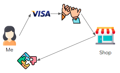
In web 3, the model is a synchronous transfer between parties. A ‘transaction’ contains both the money transfer and the goods transfer. If one of them fails (if I fail to send the coin or the seller fails to send me the digital good) the transaction just doesn’t happen.
This mental model mismatch can catch us out in a lot of ways. I showed examples of wallet transactions above. When I buy something, and if I understand this model, I should be able to check that the send and receive are both in the transaction and understand what’s going to happen.
However, if I don’t understand this model, I would think it completely normal to send coin to the seller and trust that they will later send me the digital goods. I would look at the scam transaction below (which only shows money going out) and think that my digital goods will turn up later.
Even if I understand that a transaction happens simultaneously, confusing wallet transaction screens don’t help me understand what is actually happening and know that the transaction has been written correctly.
Designing for web 3
Now we have some understanding of the difference between web 2 and web 3, and some examples of mental models and system models, let’s finally talk about how to design for web 3.
Web 3 projects usually still have a large amount of traditional application design. You’ll still be designing websites, web applications and mobile applications. The patterns and good practices we’ve developed for these are still relevant, and we'll still use them.
With a new technology, the patterns and good practices have not yet formed. We will very often need to think everything through from scratch. How does sign-up, login and authentication work? How much content can be displayed on this kind of screen? How will people interact and scroll through content? I remember in the early 2000s having discussions about how basic web navigation should work! Now it’s just something we take for granted.
Once we have designed a few applications, and have seen many in the market, we can start to see the patterns. We can then use those patterns as a basis of design. Those then become good practice.
However, design for new technologies is all bespoke. Every part has to be designed from first principles and fundamental concepts. If your normal way of starting a design is to see what other people do, you will need to think in a different way - by starting with first principles and trying a lot of approaches.
Know your users
At the heart of user experience design is understanding the users we are designing for.
The first part of this is to know who the current and likely users are and to conduct research with them. In the early stages of a technology, this group is likely to be quite small – even if the topic of your project is of broad interest, the people who are likely to be interested in the topic and in using a new technology will be small. This might make it hard to find people to research with, but it is very important to do it.
As part of the research, we want to understand what people want to do and why they want to do it. We want to learn both the tasks that people want to complete, and also the broader goals that these tasks address. For example, it may seem that someone wants to buy crypto, but what for? It might be to buy a ticket to an event, where their ultimate goal is to support an artist. It might be because they have heard it’s a high-yield investment and their actual goal is to increase wealth. Both the tasks and the goals are important to understand as they shape the way we design a product.
Design for their place on the adoption curve
For new technology, we need to understand the general idea of the adoption curve and the different characteristics of people who enter a technology at particular points in time. In particular, we need to understand our users' willingness (and ability) to learn new concepts and their tolerance for risk.
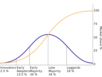
For example if you understand that most of your users are interested in increasing wealth, have some funds they can invest, and are willing to take a risk that may lose those funds, you’ll design a product differently than if your users have limited funds and a low tolerance for losing them.
As your product progresses, you’ll need to redesign a lot of it regularly. Designing for later adopters (who will have different knowledge and mental models) is very different than for early adopters.
Help people learn
A large part of designing for web 3 will be to help people learn enough about the technology and concepts so they can be effective and make good decisions. I’m not suggesting that people need to be experts, but they really do need to know enough about it, particularly where it differs from web 2. We can design for learning by:
- Knowing what people currently understand and what they need to know to be successful, then designing these learning paths.
- Designing steps in a process to be smaller, even if it means more steps – small steps help us learn concepts one at a time and add them to our existing knowledge.
- Taking a lot of care with terminology and jargon and really thinking about every word that goes onto a screen.
- Providing more feedback when an action takes place.
- Including more tips and explanation than usual.
Mental models
As I mentioned above (extensively), one of the most important aspects of designing for a new technology is connecting the users existing mental model and the actual system model.
One of the biggest decisions will be whether to expose some of the system model (which helps people to learn but may add some friction to experiences); or align closer to the user’s model (which is risky as they may not learn important things that help them to make good decisions).
Don’t forget the onboarding
For a web 3 product aimed at users who are new to the ecosystem, you’ll need to put almost as much effort into designing the onboarding as you will the main product. This is a perfect place to help people learn concepts and start to build their mental models.
Assess partners for their user experience
If you are building a product that will rely on partners for parts of the experience (particularly wallets), make sure you assess the user experience of your partners carefully. If you have a choice, choose those that have the best, most understandable experience. If you can’t choose partners, and their experience isn’t great, design to support that experience – perhaps with extra screens, extra steps, video tutorials or other support.
Conclusion
User experiences in web 3 are currently highly difficult and confusing, are stopping people from trying new websites and applications and are putting people at risk of making poor decisions or being taken advantage of.
It is, however, possible to design good experiences for web 3. We can apply all the great UX principles we know from web 2 – including usability, findability, clarity and feedback. We need to understand users' knowledge levels and mental models then carefully design to teach what they need to know and support their learning. This involves relying less on design patterns and good practices and more on designing from first principles.
I'm looking forward to seeing what we come up with and making web 3 a better place for everyone.