Extracting reusable Tailwind CSS / React components
A collection of opinions on creating maintainable, reusable and extendable React components using Tailwind CSS


When using Tailwind CSS you are opting into a utility-first workflow and while it's extremely powerful, it's easy to end up with a mess of inline classes that becomes hard to read and worse, creates inconsistency across the site where you failed to extract a repeated pattern. Tailwind CSS provides some excellent guidance on how to manage reusable styles and one of the options is to extract reusable components. This post walks through some techniques we developed that make this a lot easier when coupling React and Tailwind CSS.
Readable class names
The className attribute can easily get out of hand with all the Tailwind CSS classes and can be come hard to read (especially when it goes beyond the end of the screen and/or wraps lines).
We have found a lof of value in using clsx to help with this. clsx is a utility function that helps concatenate strings together to create CSS classnames that significantly improves the readability, flexibility and terseness of specifying those classes.
Note: this is handy not just for reusable components, but across the whole codebase once the number of classes on an element grows beyond (say) 5 or so.
Before:
<div className="relative rounded-md bg-slate-500 w-20 h-20">
    <div className="absolute -top-1 -right-0.5 bg-pink-500 shadow-sm shadow-black text-white w-4 h-4 flex items-center justify-center rounded-full" />
</div>
After:
<div className="relative rounded-md bg-slate-500 w-20 h-20">
    <div
    className={clsx(
        'absolute -top-1 -right-0.5',
        'bg-pink-500 text-white shadow-sm shadow-black',
        // You can add comments to your styling code.
        'w-4 h-4',
        'flex items-center justify-center',
        'rounded-full',
    )}
    />
</div>
Note: we were able to:
- Put similar classes together (positioning, colour, size, content, border)
- Split classes across multiple lines without having to do weird string concatenation
- Add a comment in the middle without breaking the HTML to improve readability for anything where the styles aren't obvious in of themselves
Component variants
When there is a reusable component that has a few slightly different presentations, like the above example of a grey box with different styles for the badge, we can codify that into the reusable component as variants. We've lovingly borrowed this terminology from stitches.
We can extract the common HTML markup and/or Tailwind CSS that makes up the variants into a React component and use clsx to dynamically build the class names. clsx ignores falsy values so we can do a shorthand similar to inline if statements in jsx e.g. props.variantColor === 'red' && 'bg-red'. If it returns false clsx won't add a class of false it'll just ignore it. This allows us to write really terse styles, e.g.:
function Badge(props: {
  variantColor: 'pink' | 'green' | 'red';
  children?: ReactNode
}) {
  return (
    <div
      className={clsx(
        props.variantColor === 'red' && 'bg-red-600 text-white',
        props.variantColor === 'pink' && 'bg-pink-400 text-white',
        props.variantColor === 'green' && 'bg-green-800 text-white',
        'shadow-sm shadow-black',
        props.children
          ? 'absolute -top-2 -right-1 w-8 h-8'
          : 'absolute -top-1 -right-0.5 w-4 h-4',
        'flex items-center justify-center',
        'rounded-full',
      )}
    >
      {props.children}
    </div>
  )
}
If you are using TypeScript (like the above example) you can codify the different variant options into the type (e.g. variantColor: 'pink' | 'green' | 'red') and you'll get intellisense, making the dev experience of using the component nicer.
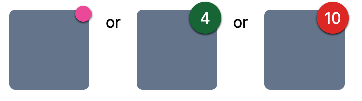
Here are some examples of using the badge component (with and without a child).
<div className="relative rounded-md bg-slate-500 w-20 h-20">
    <Badge variantColor="red">10</Badge>
</div>

<div className="relative rounded-md bg-slate-500 w-20 h-20">
    <Badge variantColor="pink" />
</div>
We generally use the variant prefix for a variant property (i.e. variantColor rather than color) because it aids intellisense (type variant and see all of the options) as well as avoiding a potential conflict with existing html attributes (color, style, type, size etc.) that you might want to pass through.
Provide flexibility with in-built escape hatch
Rather than cater for every possible use case for your component and increase it's complexity, we find it's easier and more helpful to expose a className prop to allow the styles to be extended. That way, when you inevitably have a one-off of a component that's slightly different, but still has the same base attributes you can tersely specify it without duplicating the whole component, or making that component horrendously complex with lots of edge cases. e.g.
function Badge(props: {
  // ...
  className?: string
}) {
  return (
    <div
      className={clsx(
        'bg-pink-400 text-white',
        'shadow-sm shadow-black',
        'absolute -top-1 -right-0.5 w-4 h-4',
        'flex items-center justify-center',
        'rounded-full',
        // If it's undefined then clsx ignores it - no need to conditionally add it :)
        props.className,
      )}
    />
  )
}
The great thing about using this is that the Tailwind CSS IDE intellisense works too :)
<Badge
  variantColor="red"
  className="bg-gradient-to-t from-blue-600 to-purple-700">
If there are multiple components within the reusable component that you might want to extend, like say there's a Card component with a header and a body then we use multiple class name properties e.g. headerClassName, bodyClassName and reserve className for the parent/root of the component.
Exposing the attributes of the underlying html element
Where a component wraps a HTML element, like a button for instance, it can be really handy to passthrough HTML properties directly from the reusable component down to the underlying element.
For example, if we wanted to make the grey box a reusable button component we may want to mirror the onClick handler e.g.:
function GreyButton(props: {
  className?: string
  children: ReactNode
  onClick: MouseEventHandler<HTMLButtonElement>
}) {
  return (
    <button
      onClick={props.onClick}
      className={clsx('rounded-md bg-slate-500 w-20 h-20', props.className)}
    >
      {props.children}
    </button>
  )
}
This can get quite unwieldy the more properties you want to mirror through, e.g. it would be better if it supported disabled and onBlur and various aria-* attributes. Thankfully, with some TypeScript trickery we can do it really tersely via intersection types and React.ComponentProps<'elementName'>:
type GreyButtonProps = {
  shape: 'square' | 'circle'
} & React.ComponentProps<'button'>

function GreyButton({ shape, className, ...props }: GreyButtonProps) {
  return (
    <button
      {...props}
      className={clsx(
        shape === 'square' ? 'rounded-md' : 'rounded-full',
        'bg-slate-500 w-20 h-20',
        className,
      )}
    />
  )
}
<GreyButton
    shape="square"
    // Any <button> attributes will work now.
    className="relative"
    onClick={() => window.alert('It worked!')}
    disabled
    aria-aria-describedby=''
>
    <Badge variantColor="red">10</Badge>
</GreyButton>
What about refs?
Sometimes (especially when dealing with buttons and form elements) you need to expose a ref to the underlying html element to allow:
Managing focus, text selection, or media playback.
Triggering imperative animations.
Integrating with third-party DOM libraries
-- React Docs
This is quite easy, again with some TypeScript magic (note we changed ComponentProps to ComponentPropsWithoutRef) and React.forwardRef:
type GreyButtonProps = {
  shape: 'square' | 'circle'
} & React.ComponentPropsWithoutRef<'button'>

const GreyButton = React.forwardRef<HTMLButtonElement, GreyButtonProps>((
    { shape, className, ...props },
    ref
) => {
  return (
    <button
      {...props}
      ref={ref}
      className={clsx(
        shape === 'square' ? 'rounded-md' : 'rounded-full',
        'bg-slate-500 w-20 h-20',
        className,
      )}
    />
  )
})